
Identify the mission

Shape the vision

Drive the execution
Achieving 'Mission Delivery' demands the effective implementation of actions and strategies that ensure practical outcomes that resonate with the overarching purpose of the enterprise.

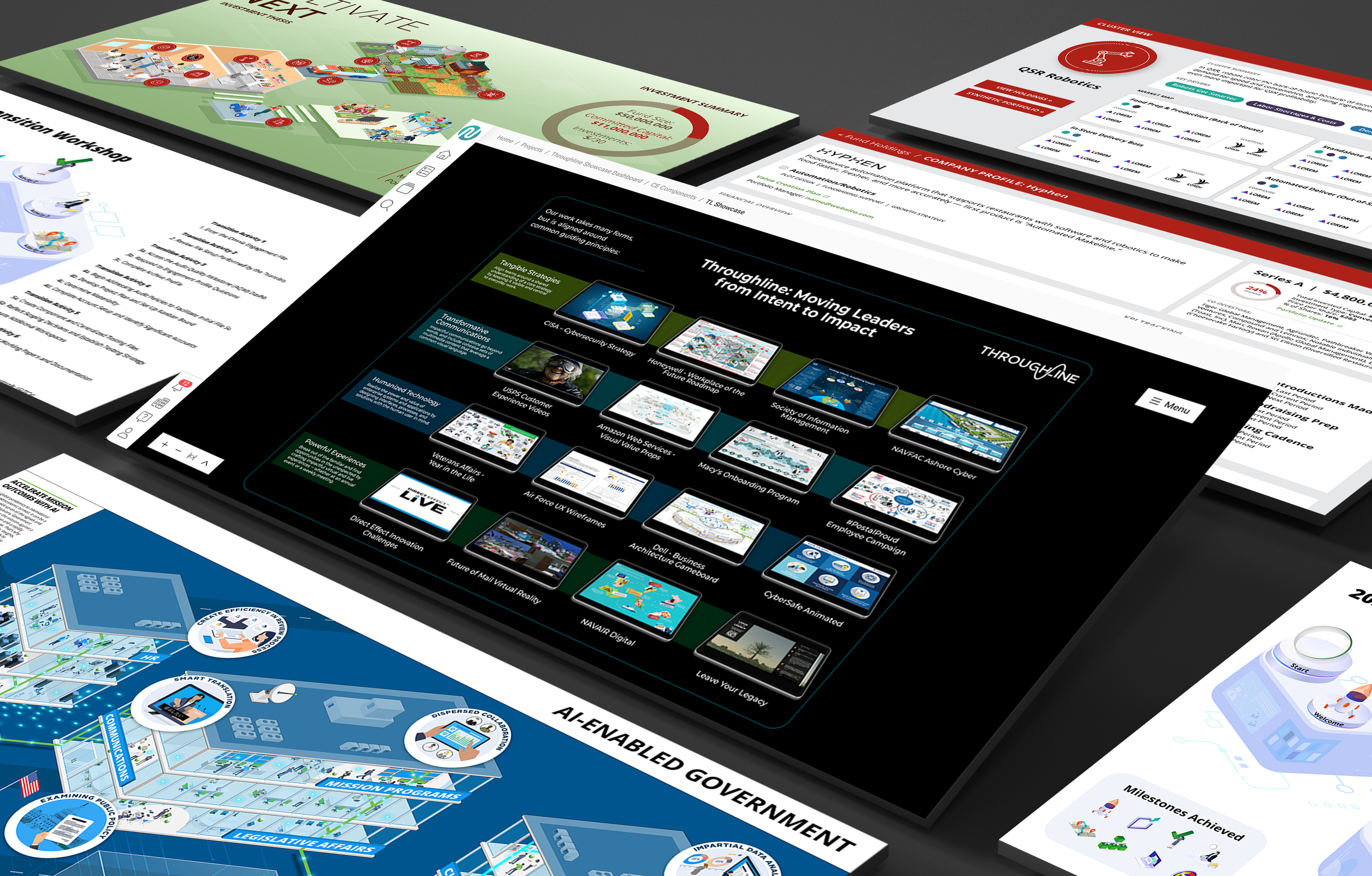
Our suite of cutting-edge technologies supports a wide range of use cases, including digital transformation communications, training, and decision support.

_grey.png)
_grey.png)

_grey.png)
_grey.png)
_grey.png)